CURE intelligence / SCRIOO
AI-powered supply chain risk intelligence platform.
Project in a minute
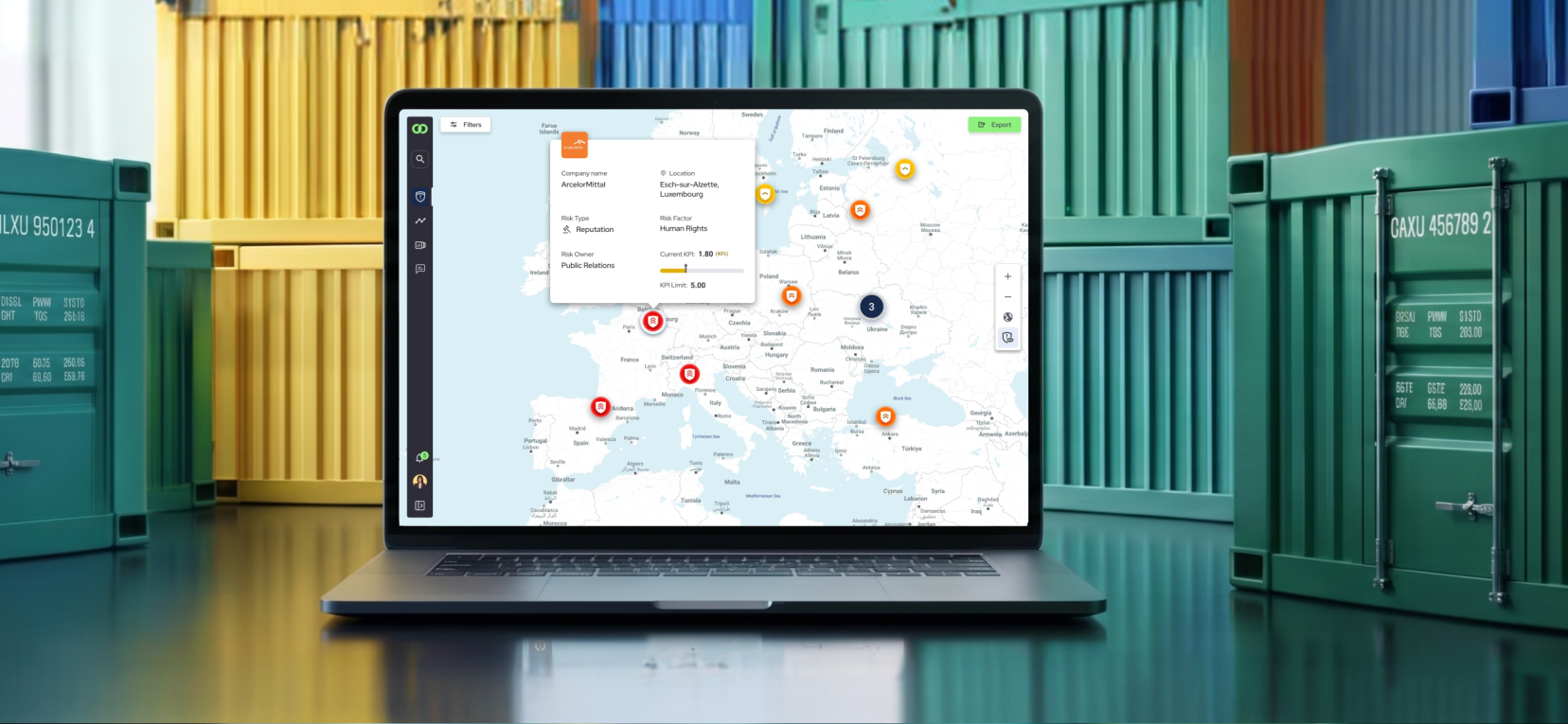
SCRIOO is an AI-powered supply chain risk intelligence platform that helps companies monitor suppliers, understand risk signals, and support operational decisions.
The product combines risk map exploration, supplier information, historical incident data, filters, documents, and compliance-related flows.
My work focused on making that complex information easier to scan, compare, and act on.
My contribution
I worked as an individual contributor on UX flows, information architecture, interface patterns, usability testing, and handoff documentation.
- Simplify how risk appeared on the map
- Design clearer ways to compare supplier incidents over time
- Use progressive disclosure to reduce cognitive load
- Structure usability tests focused on the team's riskiest hypotheses
- Document flows, states, and decisions for implementation
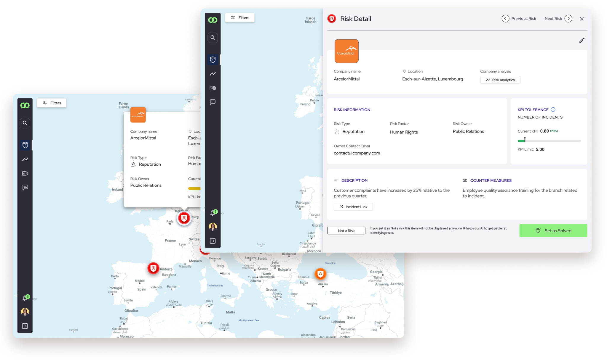
Risk information was structured in layers: first severity and location, then supplier details when needed.
What made it complex
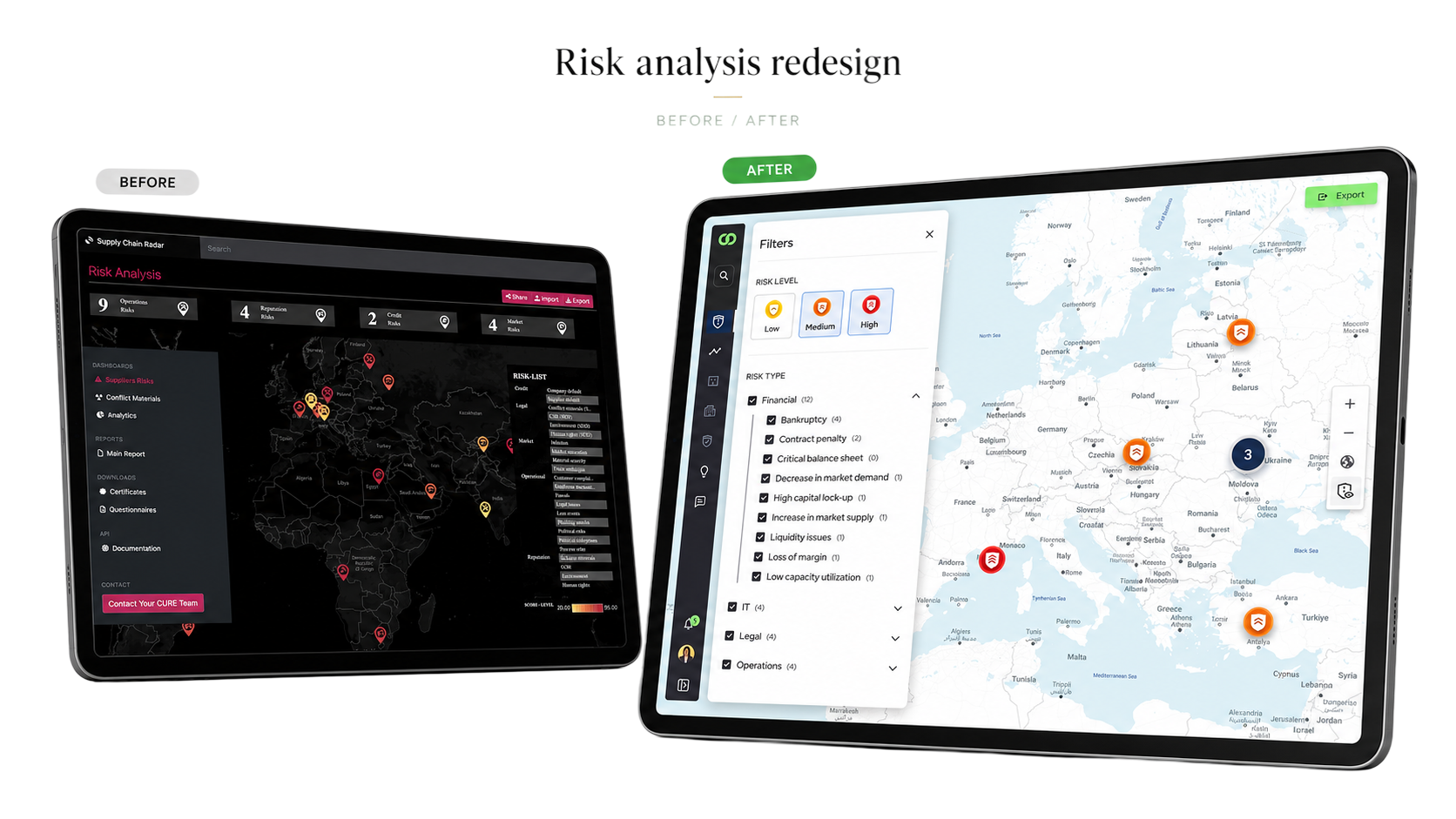
The challenge was helping users understand dense risk information without hiding the complexity behind it.
- Users needed to move from a risk overview to per-supplier details without losing context.
- The interface combined dense information: maps, risk categories, filters, historical incidents, supplier data, and documents.
- The product needed to show enough detail for informed decisions without overwhelming the first layer of the experience.
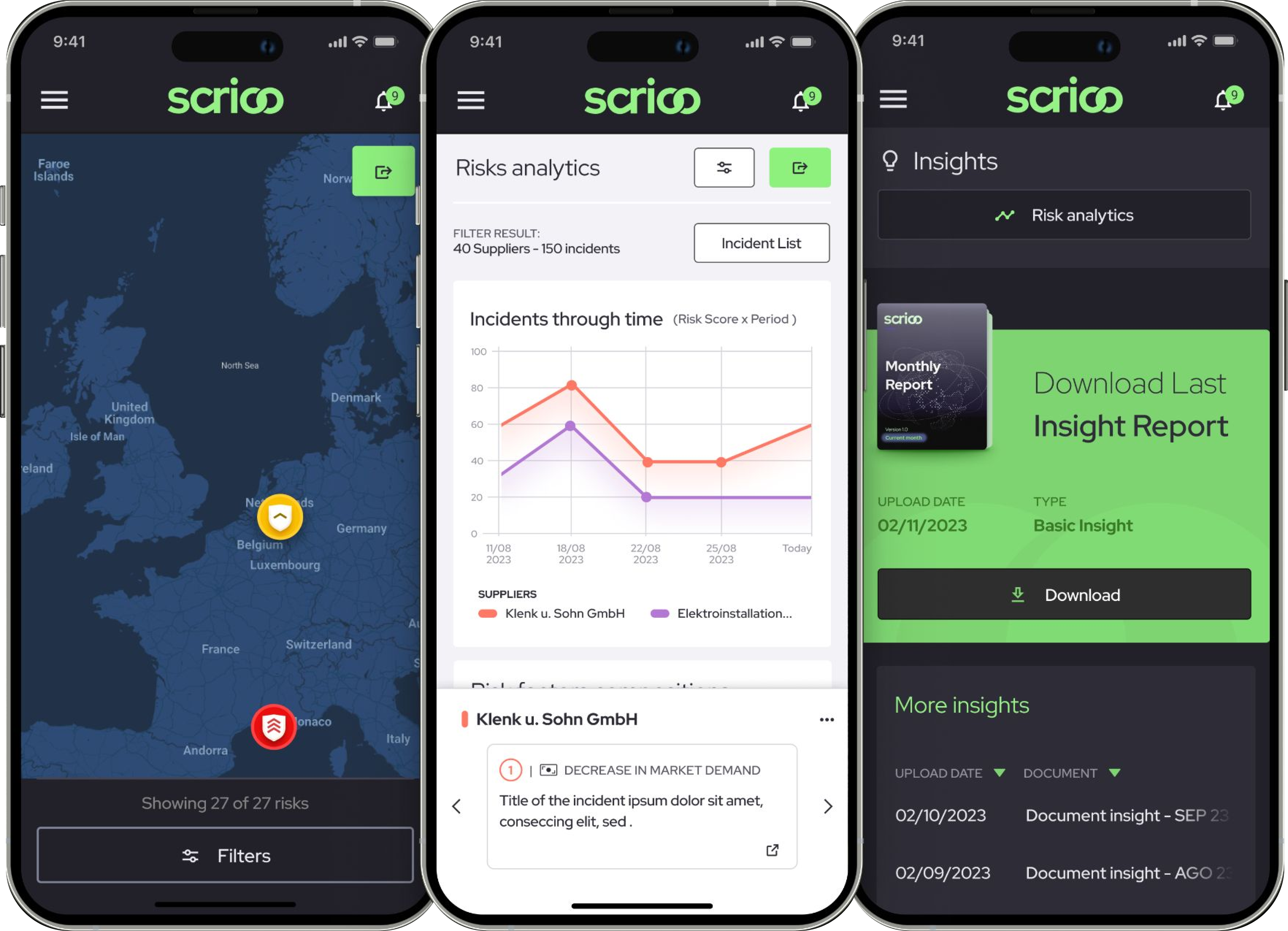
- The same risk model needed to work across map, analytics, and insights views — including mobile.
How I approached it
Understand the decision
Before designing screens, I worked to understand what users needed to decide: where risk was happening, how severe it was, and whether a supplier required action.
Reduce the first layer
I focused on what users needed to see first, especially on the risk map, where too much information made scanning harder.
Test uncertain flows
When the team had open questions, I structured focused usability tests using simplified prototypes and external participants.
Document the system
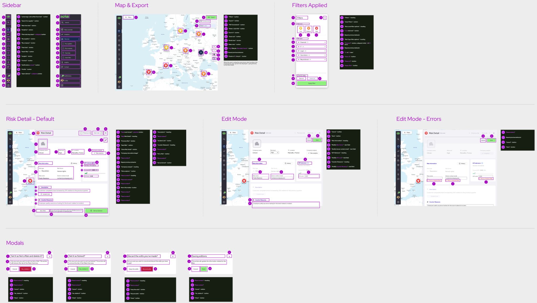
I documented flows, states, interaction rules, and handoff details so engineering could implement the experience with less ambiguity.
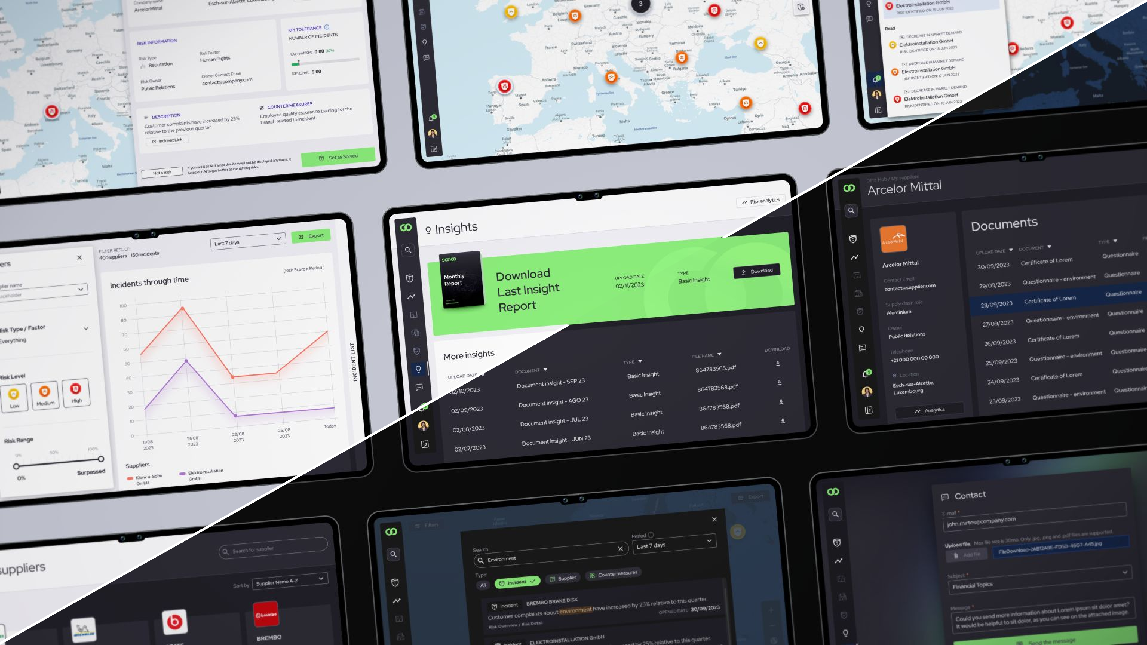
Screens explored across map, analytics, filters, documents, mobile, and light/dark themes.
Key design decisions
Design decisions that made the product easier to scan, compare, and act on.
01 · Simplify risk markers on the map
The risk map displayed many markers at once, each representing a potential risk. In an earlier direction, each marker tried to communicate multiple pieces of information at the same time.
I proposed simplifying the marker system so the first layer communicated the most important risk signal first. Additional detail remained available progressively.
The main argument was that showing less information upfront could support faster decisions, because the primary function of the map was to direct attention.
Risk severity was communicated by color for quick recognition, but not by color alone. We also included a secondary cue to support accessibility.
02 · Support supplier comparison over time
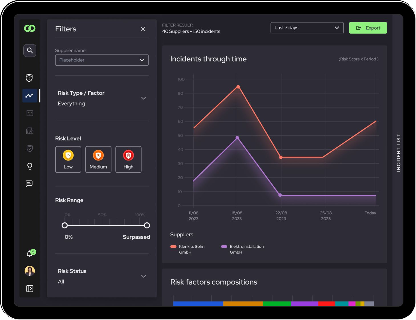
I worked on Incident Through Time, a feature that allowed comparing incidents from two or more suppliers over a selected period.
The goal was to help decision-makers understand how supplier risk evolved over time, rather than evaluating incidents as isolated events.
This supported decisions like maintaining, replacing, or monitoring a supplier more closely.
03 · Use progressive disclosure for dense risk information
A recurring principle in the project was that not all information needed to appear at the same level. The interface needed to support a sequence: identify what deserves attention, understand why it matters, then access supporting detail.
Progressive disclosure helped reduce cognitive load without hiding the complexity of supply chain risk.
Targeted usability validation
Validating clarity without direct access to end users
We didn't have direct access to end users, so I structured focused usability tests with external participants.
The goal wasn't to validate domain expertise. It was to test whether people seeing the interface for the first time could understand the structure, follow main flows, identify important risk signals, and complete specific tasks.
We only tested the areas where the team had the most uncertainty, such as map scanning, Incident Through Time, and the transition from overview to detail.
This helped the team move from internal debate to more evidence-informed design decisions, while staying honest about the limits of the research.
01 · Map scanning
Question
Could people identify the most important risks on a dense map?
Test
Multiple risk markers in a simplified scenario.
Informed
Simpler marker hierarchy and clearer severity cues.
02 · Supplier comparison
Question
Could people compare supplier incidents over time?
Test
Incident Through Time with two or more suppliers.
Informed
Chart hierarchy, labels, and comparison flow.
03 · Progressive detail
Question
Could people move from overview to detail without overload?
Test
Task moving from map overview to supporting detail.
Informed
Lighter first layer with progressive access to detail.
Selected visuals
Outcome
- Made dense risk information easier to scan and compare
- Simplified the first layer of the map while preserving access to deeper detail
- Helped users compare supplier risk trends over time
- Improved design handoff through documented flows, states, and interaction rules
Design system foundations, theme tokens, and documented states supported implementation across light and dark modes.
Reflection
This project reinforced a lesson I still use often: in complex products, the first design challenge isn't the screen — it's understanding what decision the interface needs to support.
Once that was clear, UI decisions became easier to explain, test, and document.