Theodoor
Accessible app for smart door automation.
Project in a minute
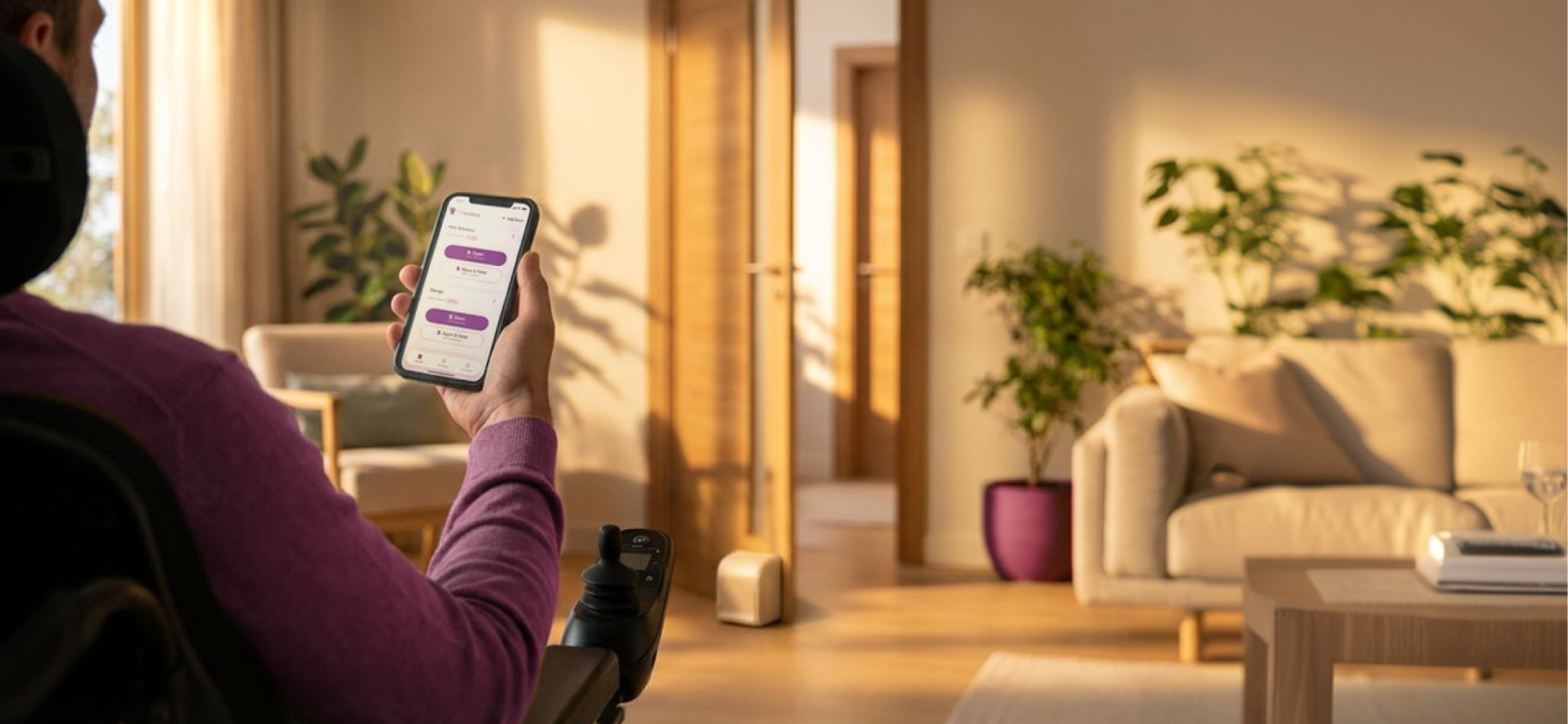
Theodoor is a mobile app for controlling an accessible smart door automation system.
My work focused on making door states, system feedback, errors, and controls clear enough that users could trust what was happening in the physical world.
Because the app controlled a real door, motion, accessibility, and feedback weren't decorative. They were part of the core interaction model.
Designing a mobile interface for a physical system where feedback, trust, and accessibility were central to the experience.
My contribution
I worked on mobile UX, UI, design system foundations, motion, prototyping, and accessibility considerations.
- Map door states and user actions
- Design feedback for opening, closing, waiting, success, and error states
- Create motion explorations to communicate system behavior
- Use AI-assisted and code-based prototypes to test interaction ideas faster
- Build reusable UI foundations for the mobile experience
What made it complex
The interface needed to explain what was happening in the physical world.
- The app controlled a physical object, so users needed to know whether a command was received, in progress, complete, or failed.
- The experience needed to support accessibility contexts where feedback couldn't rely on visual UI alone.
- Static screens weren't enough. The important part was how the system behaved over time.
How I approached it
Map door states and user actions
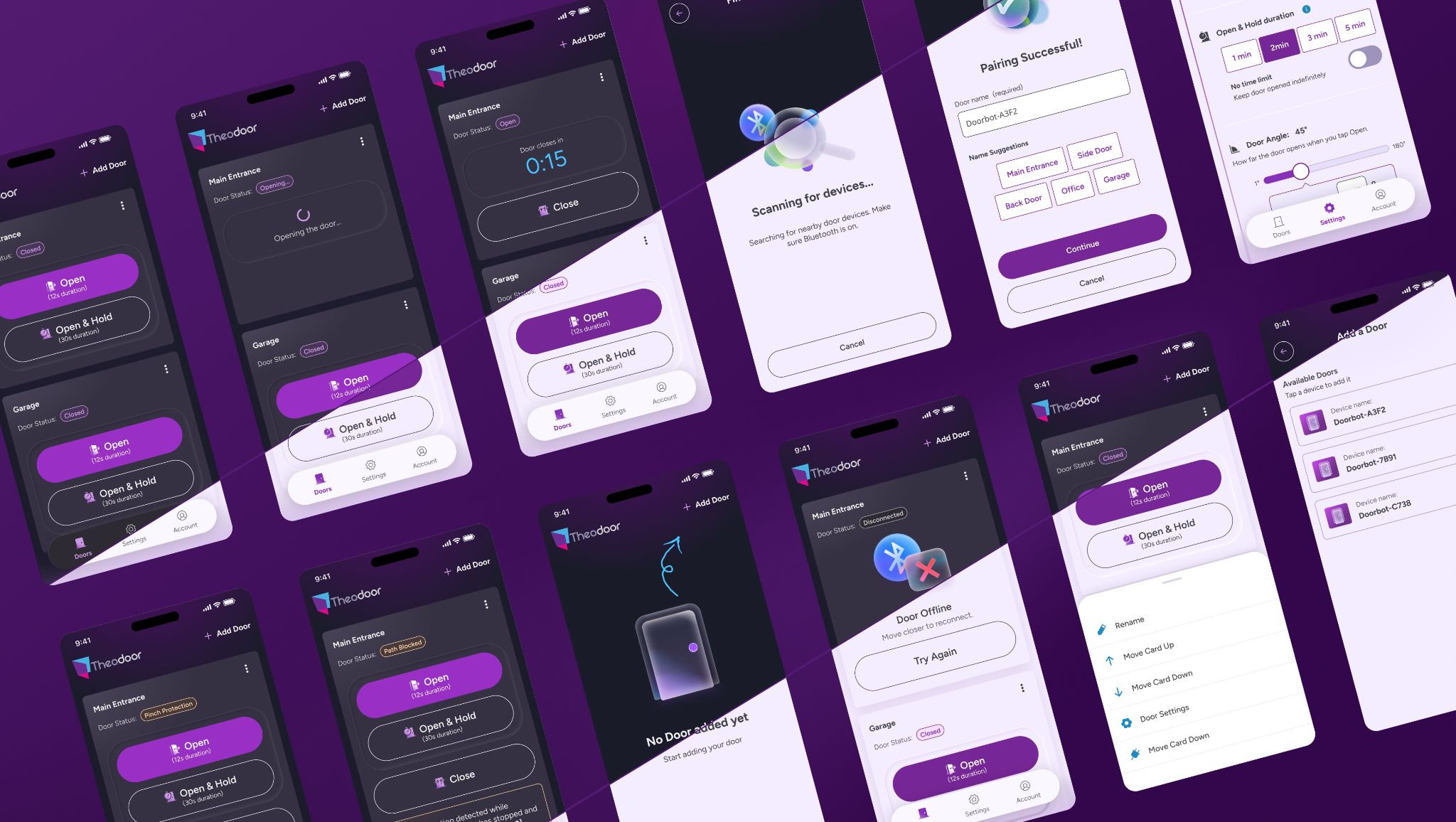
I mapped what the system needed to communicate: open, closed, opening, closing, waiting, success, error, and connection issues.
Design feedback loops
I explored how the app could confirm that a command was sent, the system was processing it, and the physical action was complete or failed.
Simulate behavior before building
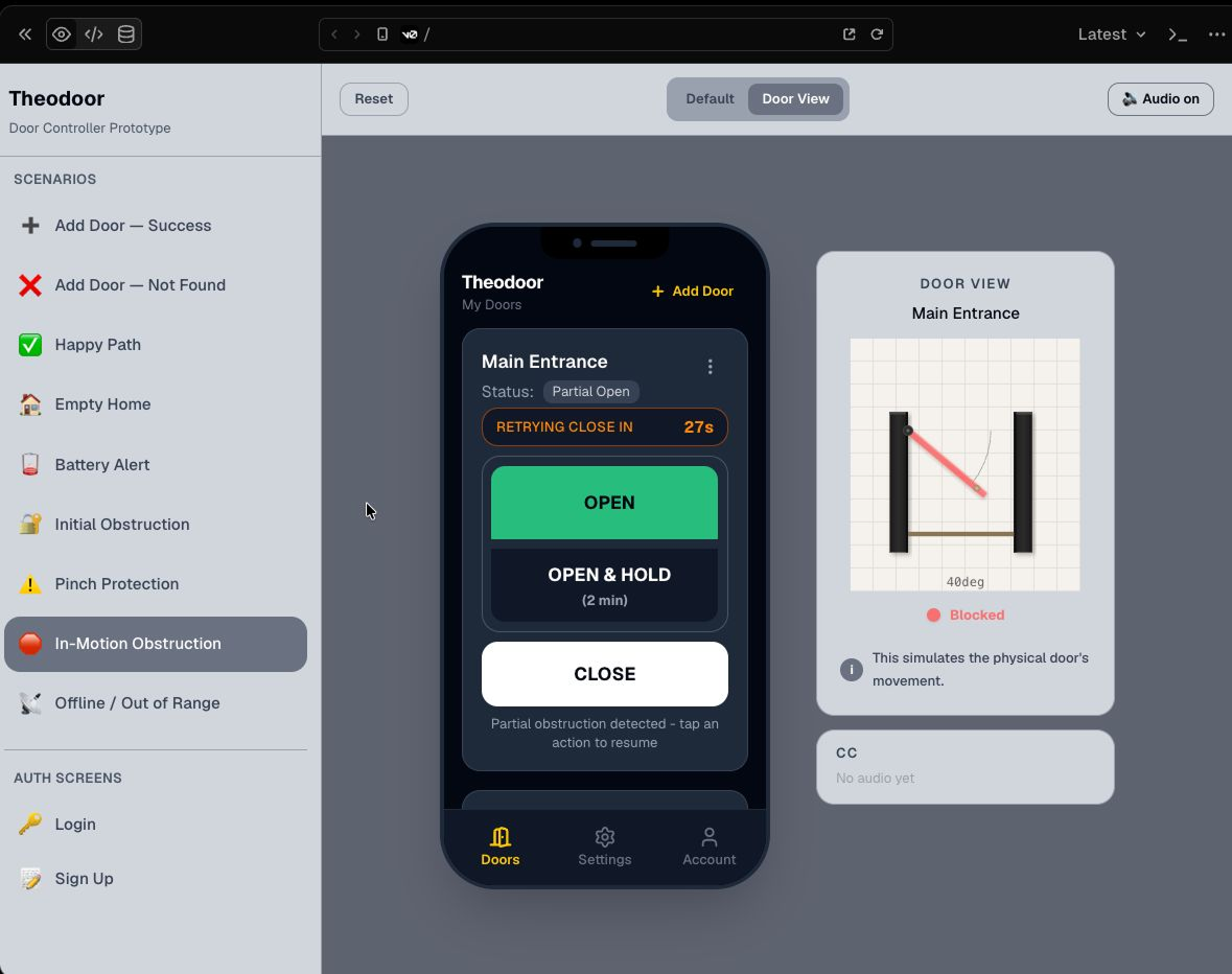
I used code-based and AI-assisted prototypes to run edge-case scenarios and make state timing and transitions visible to the team before development.
Build reusable foundations
I organized UI patterns and states into reusable foundations so the app stayed consistent as the experience evolved.
Behavioral prototyping
Static screens weren't enough to discuss this experience.
I built an AI-assisted prototype simulator to make edge cases, timing, and system transitions visible before development. The simulator covered scenarios like Happy Path, Empty Home, Door Locked, Partial Open with Obstruction, Pinch Protection, Path Blocked, Battery Alert, and Offline/Out of Range.
A Figma blueprint translated from the prototype helped bridge the simulation to the final design handoff.
The simulator made edge cases visible before development, including offline, obstruction, pinch protection, and path-blocked scenarios.
Key design decisions
Design decisions that made the physical system clearer, safer, and more reliable.
01 · Make invisible door states visible
The door could be open, closed, opening, closing, waiting, locked, unlocked, disconnected, or in an error state. I mapped these states so the interface clearly communicated what was happening, rather than leaving users guessing after tapping a button.
02 · Use motion as system feedback
Motion was used to explain behavior, not just to make the app feel more polished. I explored animations for scanning, waiting, pairing, success, empty states, and error recovery so users understood what the system was doing over time. This was especially important because the app controlled a physical door — users needed feedback that a command had been received, was in progress, or required attention.
03 · Design feedback beyond visual UI
Since this was an accessibility-oriented product, feedback couldn't rely only on what users saw. The interaction model considered visual, haptic, and audio feedback so system status could be understood across different contexts and by different users.
04 · Prototype behavior before development
Static screens weren't enough to discuss this experience. I used prototypes, AI-assisted exploration, and code-based experiments to make behavior tangible before implementation, helping the team discuss timing, transitions, edge cases, and system feedback.
Motion + AI
Motion was used to explain system behavior, not just to make the app feel more polished.
For states like scanning, pairing, empty home, waiting, success, and failure, static screens weren't enough. Animation needed to show that the system was searching, processing, or waiting for the user's next action.
I used AI-assisted and code-based workflows to speed up motion production, refine animation timing, and prepare Lottie outputs ready for implementation.
The goal wasn't to automate taste. It was to reduce repetitive production work so I could focus on clarity, timing, and how motion supported system feedback.
Scanning and waiting states
Motion made the waiting state feel active and understandable while the system searched for nearby door devices.
Empty state motion
The empty state guided users toward the next action without making setup feel broken or incomplete.
Lottie production workflow
Motion explorations were refined into implementation-ready Lottie outputs.
Design system foundations
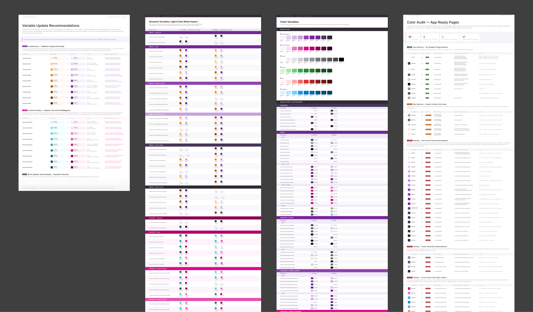
I organized reusable UI foundations for the app: buttons, cards, status labels, door states, feedback patterns, navigation, empty states, setup flows, errors, and recovery states.
This helped keep the experience consistent across normal use, setup, settings, motion states, and edge cases.
Reusable UI patterns helped the app handle setup, normal use, settings, errors, and recovery states consistently.
Outcome
- Made door status and system feedback easier to understand
- Created clearer interaction patterns for success, waiting, error, and recovery states
- Supported accessibility through multimodal feedback rather than visual-only communication
- Helped the team discuss physical-digital edge cases before implementation
- Built reusable UI foundations for the mobile experience
- Prepared motion assets for implementation through Lottie output
Reflection
This project reinforced that accessibility isn't a checklist at the end of the process.
When a digital interface controls something physical, accessibility, feedback, and trust need to be part of the core interaction model.