Intuit for education
Financial education experience for students.
Project in a minute
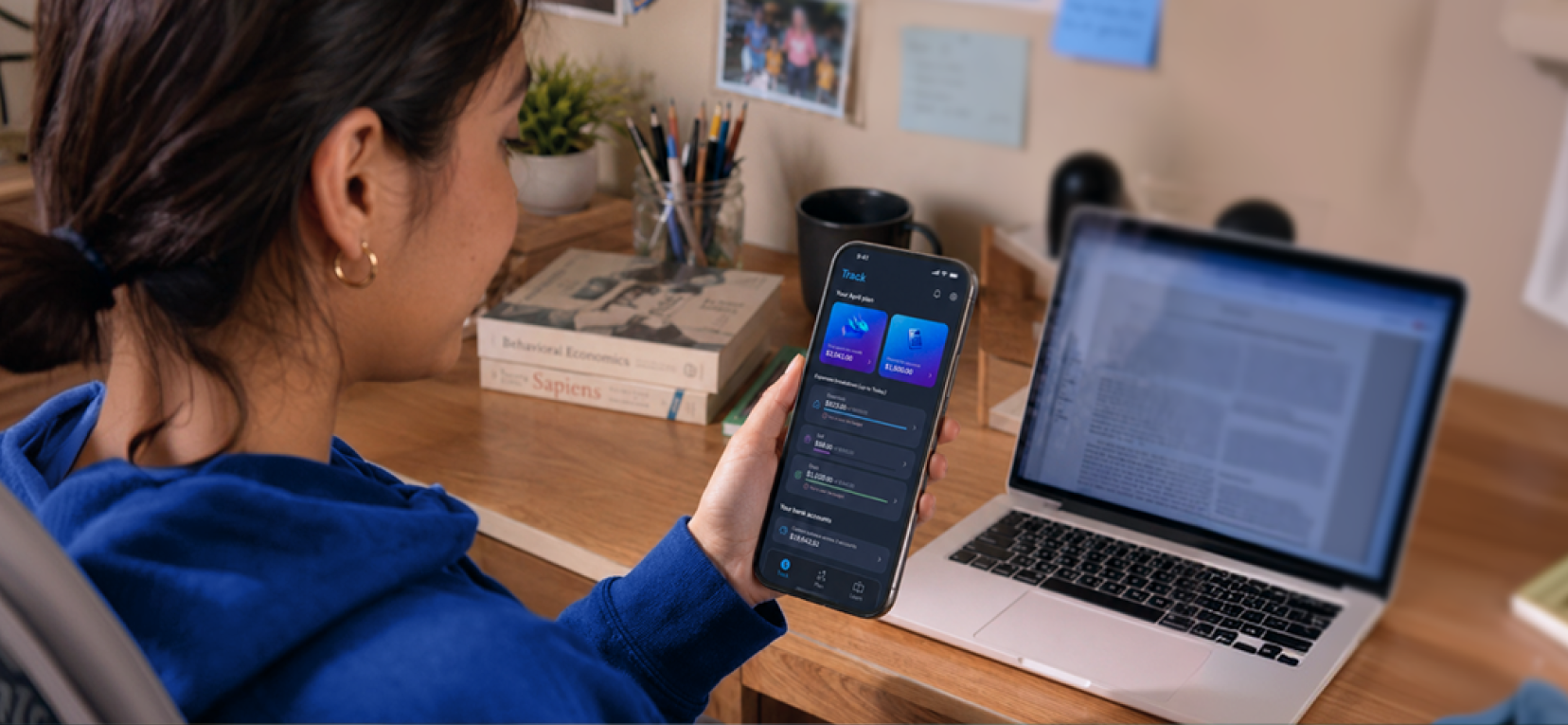
Intuit for Education was a financial education product designed to help students relate to money through a more accessible and intentional digital experience.
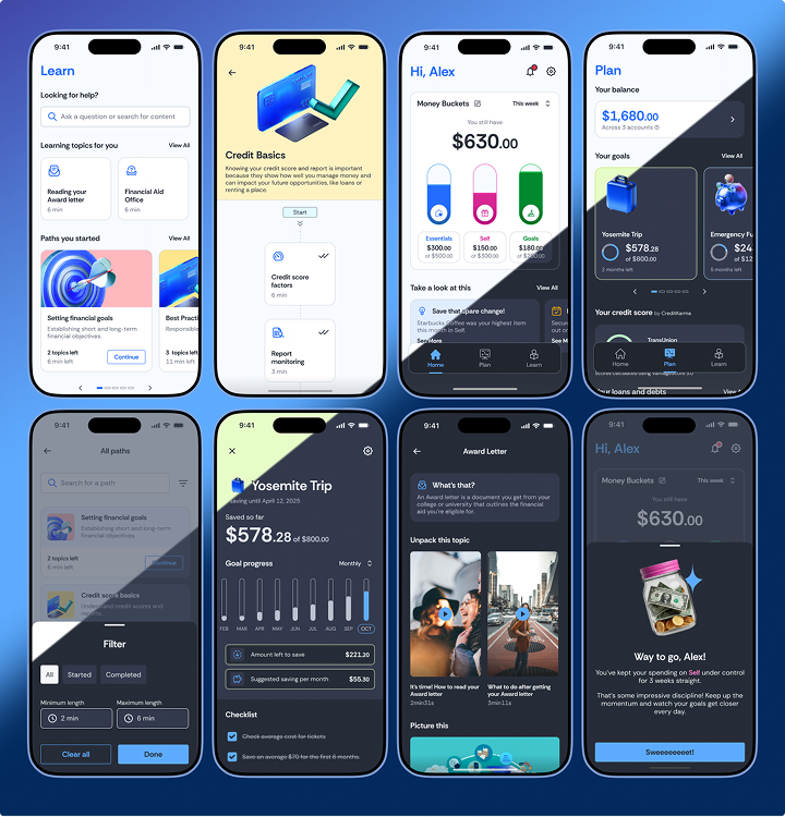
The product was built around three connected modules: Track for present-day and everyday financial awareness; Plan for future goals and financial intention; Learn for contextual financial knowledge, delivered at the right moment.
The challenge was making financial concepts feel learnable rather than overwhelming, while building a product system flexible enough to support themes, states, dark mode, and a rich illustration language.
Track, Plan and Learn in light and dark mode: the product system needed to support multiple themes, illustration contexts, and interface states with consistency.
My contribution
I joined the project before the Design Lead and helped shape the product's initial UI foundation.
I created the initial design system structure, designed the majority of screens, and worked daily with the Design Lead and PM to review flows, hierarchy, product logic, and client-facing decisions.
- Create the initial design system structure and reusable UI foundations
- Design the majority of product screens across Track, Plan, and Learn
- Translate financial concepts into concrete, learnable interface patterns
- Apply visual direction across themes, states, modules, and product surfaces
- Collaborate with the Design Lead and PM to refine hierarchy, flow logic, and client-facing decisions
What made it complex
The product needed to make money feel clear, useful, and learnable for students.
- Students had different levels of financial confidence and experience, so the product needed to feel accessible without trivializing money.
- The product needed to connect three distinct behaviors: tracking money day to day, planning future goals, and learning financial concepts.
- Research needed to combine multiple perspectives: students, course coordinators, financial aid stakeholders, and client expectations.
- The design system was being created while product direction was still evolving, so the foundations needed to be flexible without becoming loose.
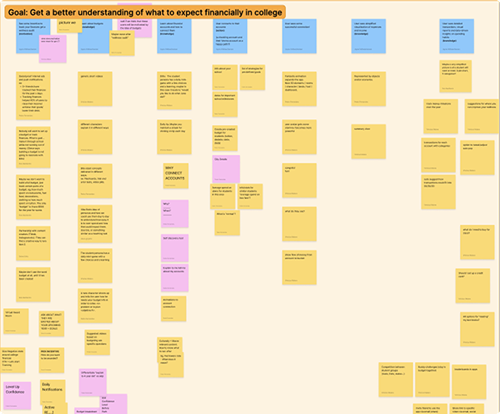
Stakeholder and client conversations mapped in FigJam helped clarify goals, expectations, and what “financial education for students” meant in product terms.
Research and direction validation
The project combined discovery interviews, stakeholder conversations, and visual direction validation.
We talked with Gen Z college students, course coordinators, and financial aid stakeholders within the university to understand everyday money challenges, planning needs, and confidence in financial decisions.
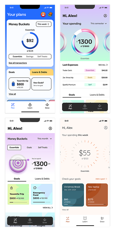
We also used Maze to compare UI directions and identify which visual approach had the strongest reception with the target audience.
Research and Maze validation helped the team align on product direction, tone, and visual approach before scaling the UI system.
How I approached it
Ground direction in research
We started with interviews and conversations involving Gen Z college students, course coordinators, and financial aid stakeholders within the university. This helped the team understand what financial education for students meant beyond the interface: everyday financial stress, planning needs, institutional support, and confidence in financial decisions.
Build the foundation early
I created the initial design system structure before the Design Lead joined — tokens, typographic scales, color foundations, and reusable components — so the team had a stable base to build from.
Explore and validate visual directions
We explored multiple UI directions and used Maze to understand which visual approach had the strongest reception with the target audience.
Design across Track, Plan, and Learn
Each module had a different user intent and information hierarchy. I designed across all three while keeping the system and visual logic consistent.
Work in daily three-way review
Every morning, the Design Lead, the PM, and I reviewed flows, discussed hierarchy, resolved product logic questions, and aligned on client-facing decisions.
Key design decisions
Design decisions that shaped how the product communicated money, progress, and learning.
01 · Connect Track, Plan, and Learn
The three modules weren't separate products — they needed to feel like a single experience with shared logic. Track informed Plan. Plan surfaced Learn moments. I designed the connective tissue between them so users could move fluidly from today's spending to a future goal to a relevant financial concept.
02 · Turn financial goals into visible progress
Abstract financial goals are hard to act on. I translated those goals into visual progress states — active targets with contribution tracking, timelines, and clear next steps — so users felt forward movement rather than just seeing a number.
03 · Design Track as daily financial awareness
Track was the daily entry point. It needed to show what was happening today without requiring effort or prior financial knowledge. I designed the experience to surface spending breakdowns, budget states, and check-in moments as contextual, ambient information.
04 · Make learning modular
Learn content needed to work as standalone moments, not just as a course. I designed the module as a navigable, contextual layer so financial concepts could appear when relevant to a user's goal or spending pattern — not only when they navigated to a dedicated section.
05 · Build a flexible visual system with AI-assisted illustration
The illustration style helped make financial topics feel less abstract and more approachable. The challenge was using rich visuals without letting them override the product UI. I helped apply the visual language across screens and modules so it supported clarity, hierarchy, and engagement.
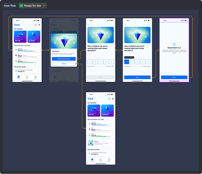
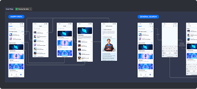
Track flow: check-in modal and financial confidence survey giving the user a moment of reflection within the daily money view. Learn flow: Happy Path and General Search with modular, navigable financial content presented in context rather than isolated in a course structure.
AI-assisted illustration language
The product used a rich AI-assisted illustration style developed by the design team. These illustrations helped make financial topics more accessible, emotional, and memorable for students, while still supporting a trustworthy product experience.
My work connected that visual language to the product UI, applying it across onboarding, Track, Plan, Learn, goals, cards, and learning moments.
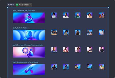
AI-assisted illustrations helped transform abstract financial concepts into more approachable product moments. Illustration bundles organized in Figma by financial topic, each set paired with contextual photography assets for content modules.

Product system foundations
I created the initial design system structure before the Design Lead joined — tokens, color functions, typographic scales, component foundations, and reusable patterns across Track, Plan, Learn, Onboarding, Goals, and Setup.
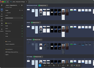
The system needed to support light and dark themes, font scaling across different device sizes, multiple illustration contexts, and a product-ready handoff structure that engineering could use with less ambiguity.
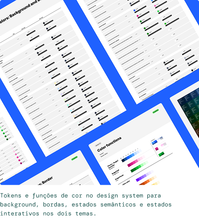
Color tokens and functions in the design system for backgrounds, borders, semantic states, and interactive states across both themes. Production UI file structure: Master, Default, Dark Mode, and Font Scaling pages organized for handoff and team use.
Outcome
- Designed the majority of screens across Track, Plan, and Learn
- Created the initial design system structure, including tokens, typographic scale, colors, and reusable patterns
- Applied the AI-assisted illustration language consistently across product surfaces
- Supported dark mode, font scaling, and multi-theme system flexibility
- Used research interviews and Maze validation to inform product direction and visual approach
- Collaborated daily with the Design Lead and PM to align hierarchy, flow logic, and client-facing decisions
Reflection
This project taught me how much early design system work shapes everything that comes after. Building stable foundations before product direction was fully defined required judgment calls that held up through significant changes.
Working closely with a Design Lead in a daily three-way review with the PM was one of the most effective collaboration structures I've experienced. Each person owned a distinct part of the problem, and that clarity made fast, quality decisions possible even under ambiguity.